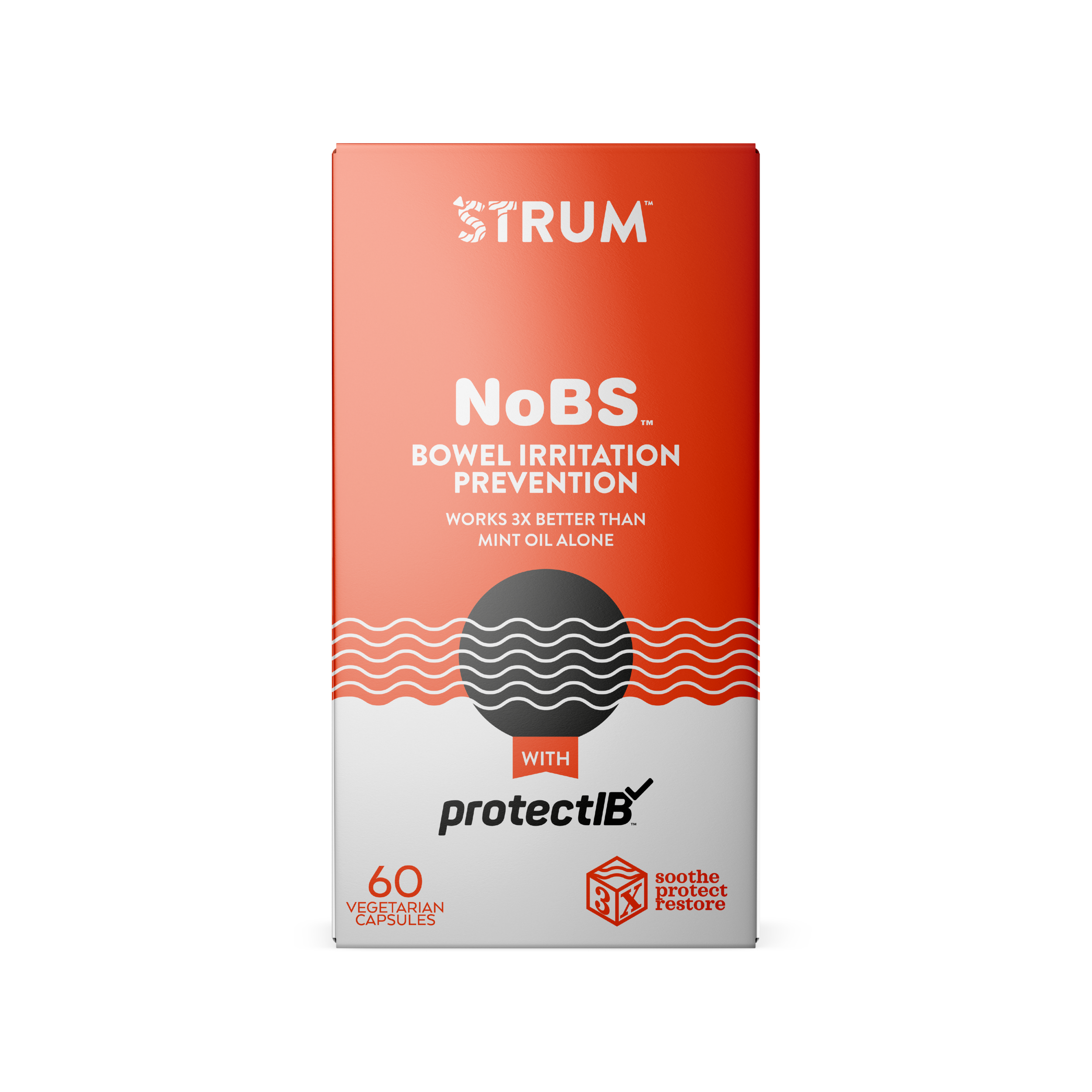
The Client: Pantheryx
Service: Label and Package Design
Note: I worked on this project while working as an Art Director for Foerstel Design. Unfortunately the client decided not to produce the product.
THE CHALLENGE
‘Strum™ is one of the more challenging creative projects I have had in my career so far. It was a project filled with outliers and oddities, special requests from the client, and all centered around a very specific niche. That being said, this is what you need to know:
No, this is not a guitar brand
It is actually a dietary supplement for gut health
The main ingredient is Bovine Colostrum (hence the name ‘Strum)
The client wanted to allude to musical instruments in the design of the logo and the Primary Display Panels (PDP) of the packaging.
So, colostrum + musical instruments + gut health = ?

THE PROCESS
I could type up a lot of seemingly relevant filler about the creative process and the mysterious enigma that is the artists mind. But let’s be real, I’m not Salvador Dalí.
So I googled. A lot.
Next, I went to the local shops to check out what potential competitors’ packaging looked like. And, I do not know about you, but the whole experience was quite depressing. The dietary supplement aisle seems to be chock full of beige color schemes or “bro-dude” stylizations that look more like they belong on a video game interface than a health product.
My first thought, let’s pump those colors up. If I were the consumer, especially one with some gut health issues, I would be feeling pretty glum about the whole situation already. And that’s not what I want conveyed with a product that’s supposed to help such issues.
Then of course, sketches on sketches on sketches.
Once the ideas were down on paper, I set to work on the digital layouts and mockups.
ANATOMY OF THE PACKAGING


